It may not officially be the colour of the year, but if last week's Oscar red carpet was any indication, hot pink is one of the hottest colours of 2019.
From Angela Bassett to Helen Mirren to Gemma Chan, Hollywood's elite went ultra girly with feminine florals, ruffles and oh so many shades of pink at this year's Oscars.
Since its big boom in 2017, millennial pink has gotten only hotter and there's little wonder why.
READ: How To Decorate With Pantone’s 2019 Colour of the Year: Living Coral
"I love working with pink," interior designer Tara Fingold says. "It adds a fun and happy punch of colour and brings a smile to one’s face as you enter a room."
Acknowledging that it's not for everyone, Fingold says those who are comfortable with colour should experiment with pink. "There are so many amazing shades, from soft blush tones to fiery hot pinks — every tone evokes a different feeling," she explains.
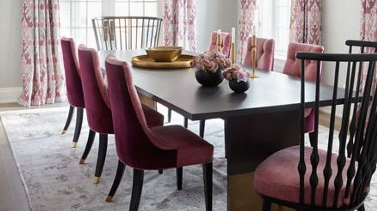
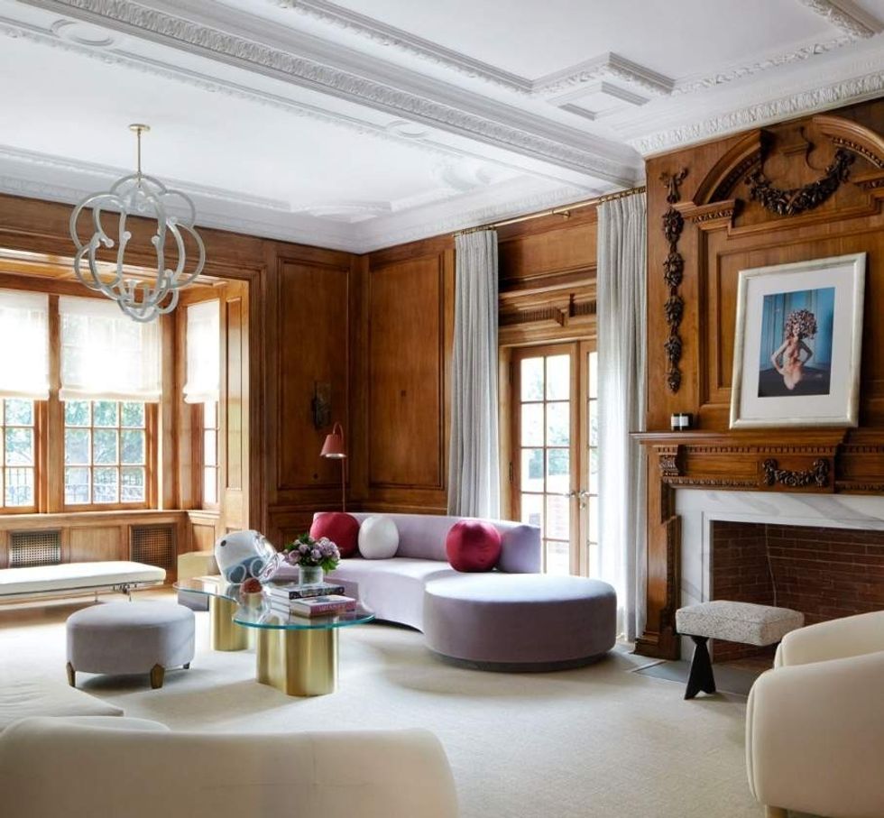 Photo by Virginia Macdonald.
The designer, who admittedly decorates with a lot of pink, says the old school rules of mixing colours no longer apply. "I don't think there are any 'nos' anymore," she exclaims. "In old school decorating there used to be certain 'rules,' whereas you could only pair pink with complementary colours such as green. Now there are no 'rules.' We can pair pink with blue, with purple and even mix different shades of pink. An eclectic look creates a fun, playful room."
Of course, some colours do go better with hot pink than others. Designer Elana Safronsky of EMME Design recommends pairing pinks with navy, black, forest green and yellow, while Fingold says you can't go wrong with whites and greys.
READ: 2019 Paint Trends: 5 Colours That Will Be Everywhere Next Year
Contrary to popular belief, you don't have to be brave nor bold to decorate with hot pink, but you do need to be deliberate.
Though the colour lends itself to more than accent pieces, Fingold recommends using throw pillows and art as a means of incorporating the colour into your home. "I think that you need to use pink in a well-curated way that you will not tire of," she explains.
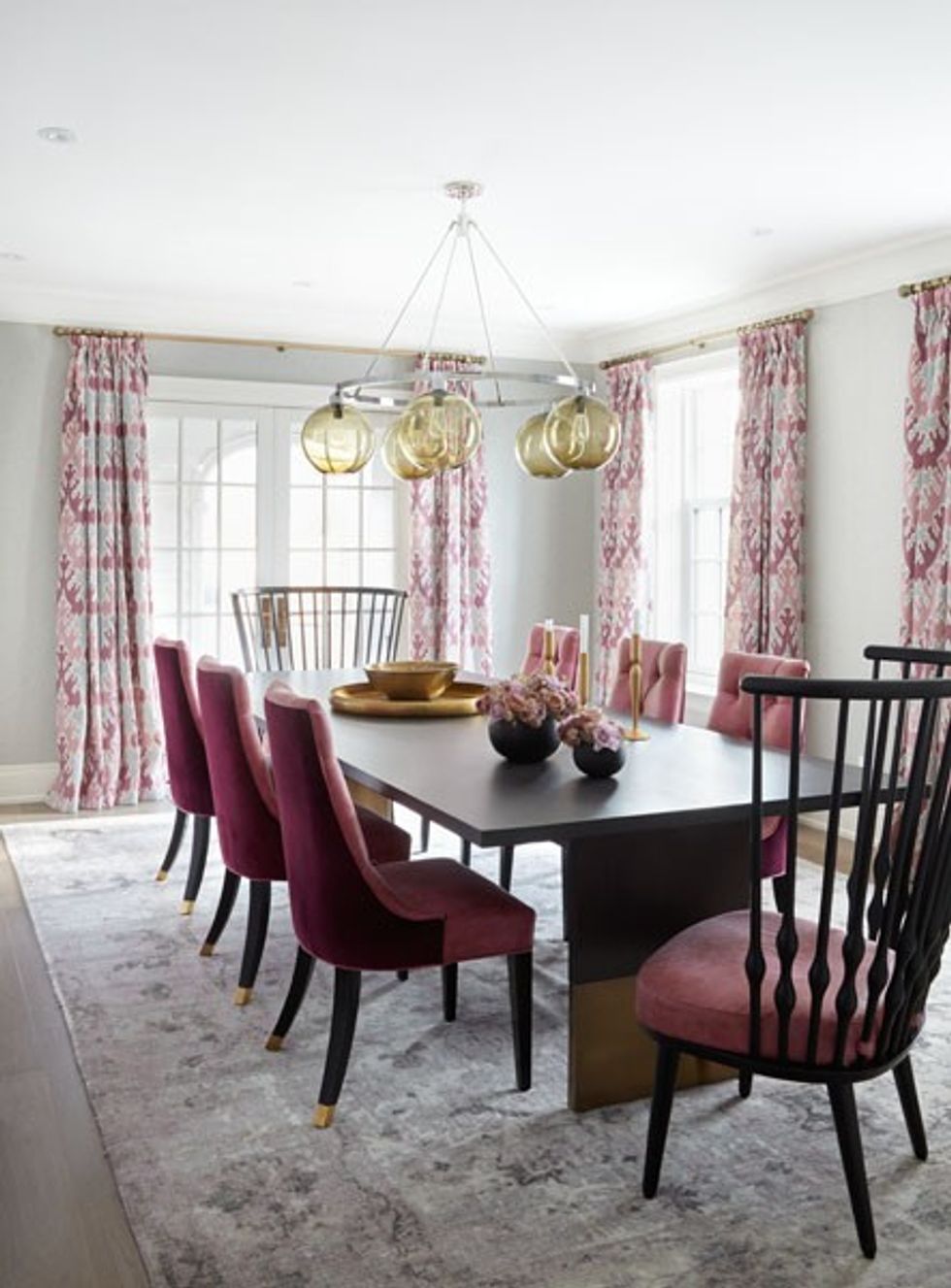 Photo by Virginia Macdonald.
Picking the right shade will also help you connect more with the colour. If you are up for something lively, Fingold suggests fuchsia. If you are looking for something more calming, Fingold recommends blush.
READ: 5 Design Trends That Were Big At The 2019 Toronto Interior Design Show
A personal favourite for Fingold, blush is her shade of choice when it comes to interior decorating. The designer loves the colour so much she converted her old grey dining room into a vibrant new space with plenty of blush pink accents.
"My husband was quite shocked when he saw it as it was such a departure from our grey dining room, but I love it. It's so cozy and fun for entertaining," she said. We couldn't agree more.